UI DESIGN / UX DESIGN
Project Overview
My Role
I lead the design, testing, and development of this project from beginning to end.
Problem
Many pet owners are facing time constraints of a busy schedule that makes shopping for pet food a challenge. Often, owners will find a brand at the local pet store that meets their needs financially, however it usually does not meet the nutritional needs of the pets. As well, there are often times brands go out of stock for a period of time, forcing owners to have to switch food brands, which can cause health issues for their pets.
Goal
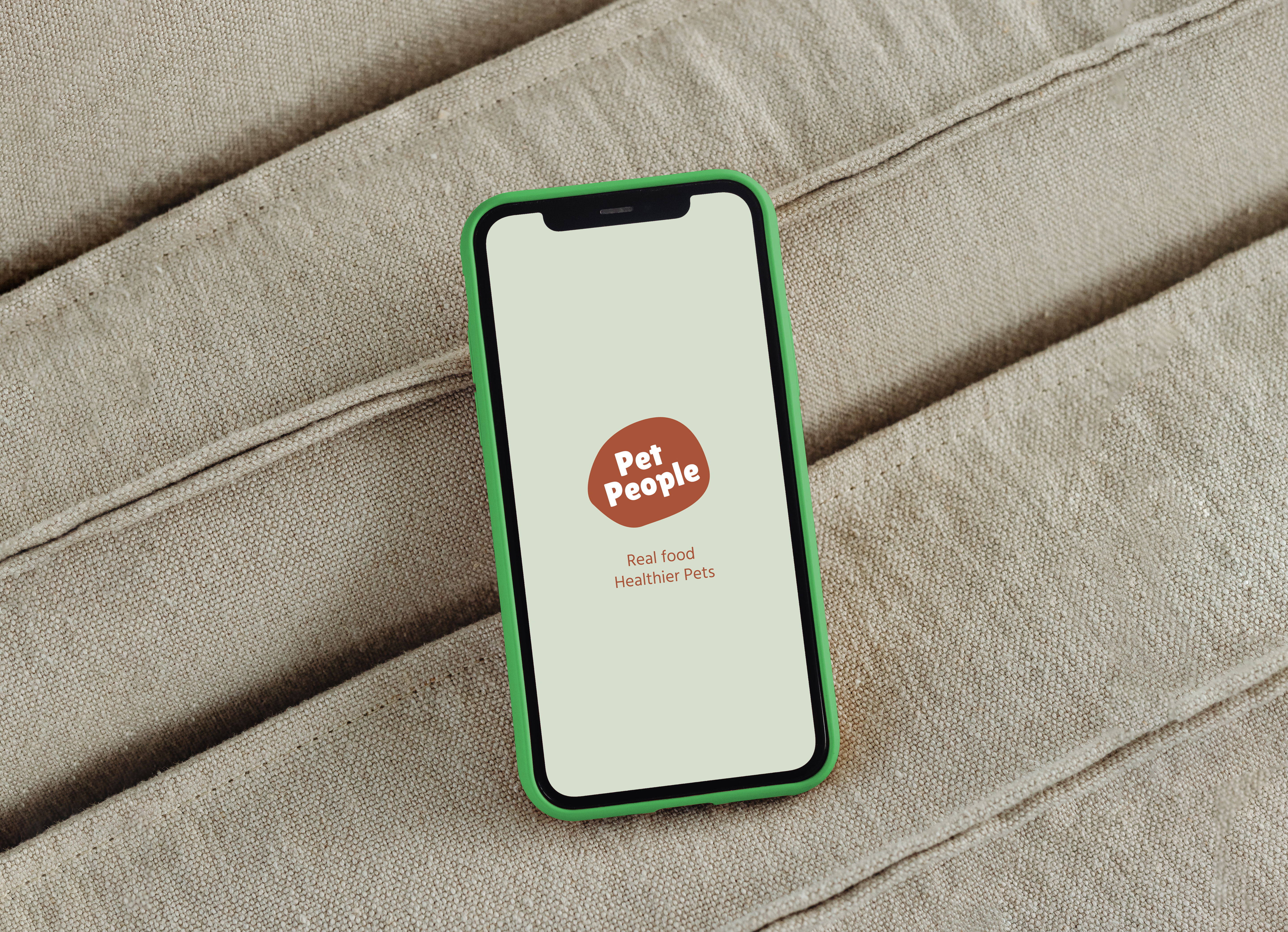
The goal is to create a service for pet owners which will allow users to easily purchase food for their pets in a few steps and allow them to have a simple and fast checkout process. In addition, the service is accessible through a dedicated mobile app, which will make the process easier and target customers that have busy work/life schedules and who have little time to go to the pet store to research brands.
Early Ideation
Pet owners love their pets and consider them to be a part of their families and want to feed them nutritious food that is good for their health, promoting a long and healthy life for their pets. Therefore, I wanted to design a solution that can give pet owners ease at food selection and purchasing, making shopping for pet food more accessible to those with little time or little technological knowledge.
I conducted user research and created user stories and personas to better understand my users’ needs and goals.
User Research
A primary user group identified through research was working adults on a budget who have a hard time finding pet food brands that have an affordable, consistent cost. Research also revealed that purchasing pet food is often a time-consuming task for many target users.
Pain points
Busy Schedule
Time
Financial Limitations
Working adults are too busy to take the time to research all current pet food brands in the market.
Working adults don't have much time to travel to a physical location to purchase pet food.
Working adults on a budget have trouble with fluctuating costs of pet food often as it fluctuate from store to store and, as well, costs fluctuate due to store cycling sales.
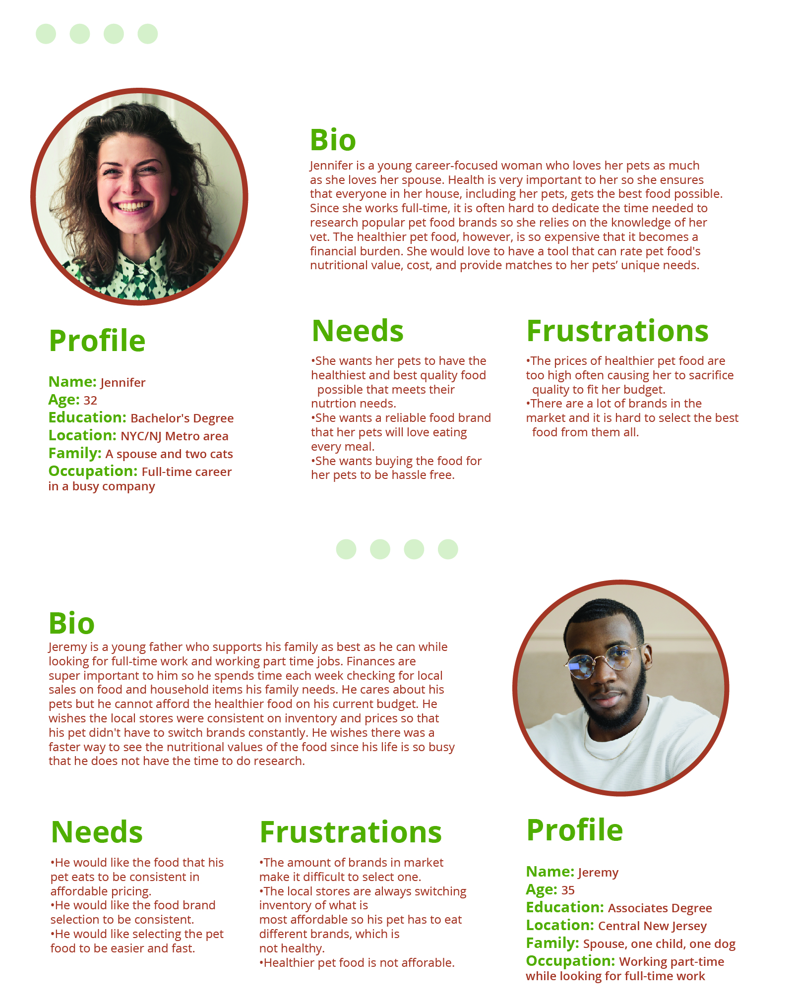
Based on these findings, I created two persona who represent the target users
User Personas
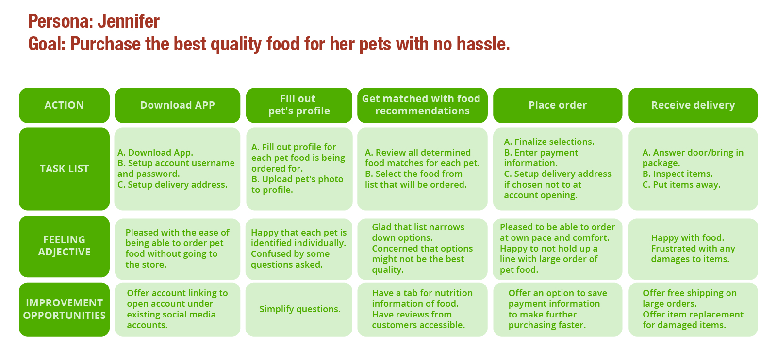
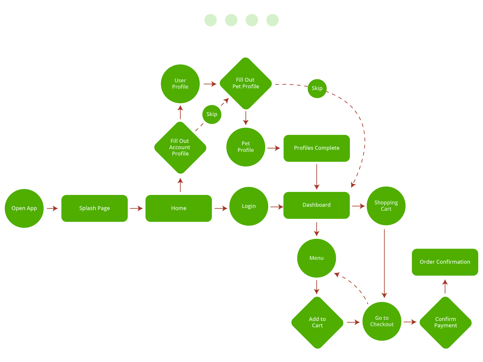
In addition to the personas, I also created a user journey map and user flow for the app’s main functions. I wanted to understand how my users would complete a function and what they would need to accomplish it.
User Journey Map
User Flow
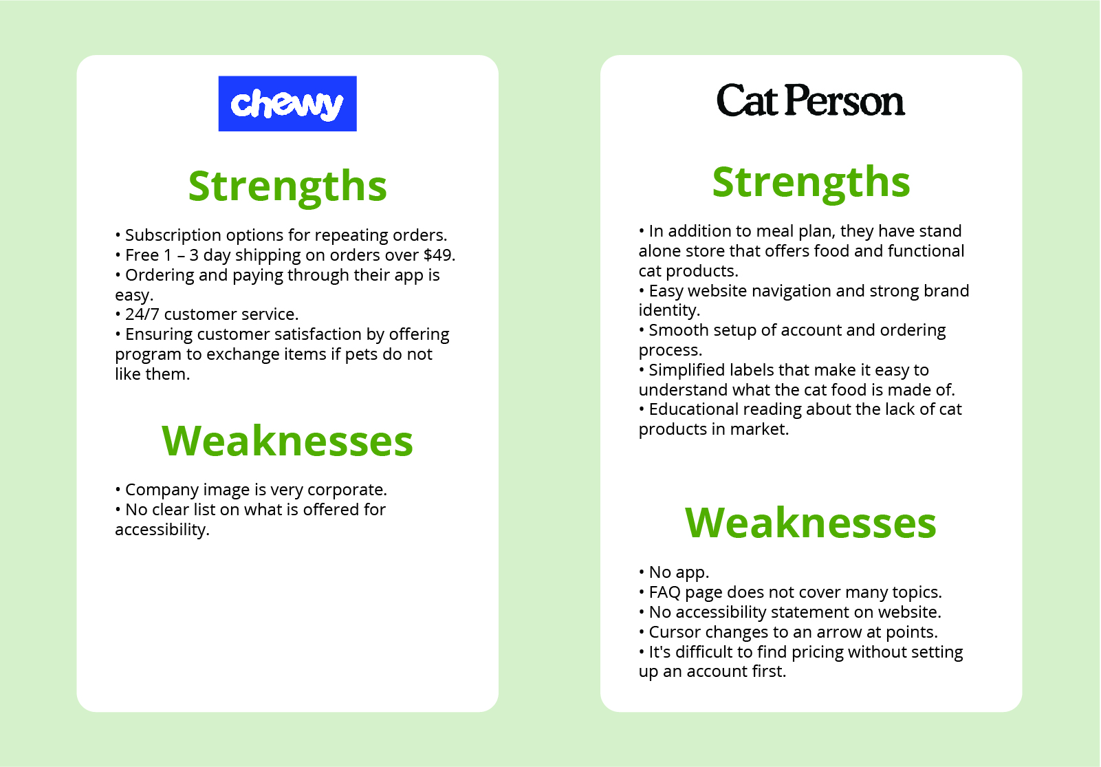
Competitor Analysis
In order to construct a solid foundation for Pet People, I conducted market research and competitor analysis to better understand who my competitors are and what they do well or poorly.
Sketches
Before I moved onto high fidelity mockups, I wanted to establish the core of the mobile app. I wanted to ensure the sign-up process was quick and easy by giving users options to speed up sign-up with popular account-linking options. Another main feature I wanted was to give the users the option to skip filling out profiles. This will help users who do not want to spend too much time on sign-up advance to the dashboard quicker.
Paper wireframes
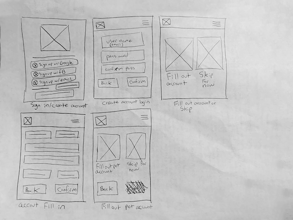
Initial UI Design and Wireframe
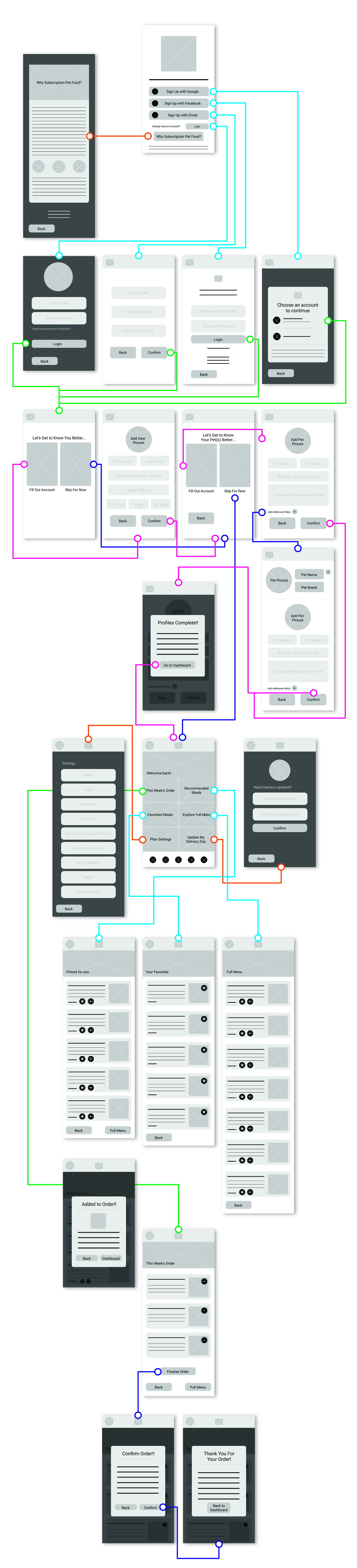
Low-fidelity prototype
Using the completed set of digital wireframes, I created a low-fidelity prototype. The primary user flow I connected was signing up for an account and viewing menus, so the prototype could be used in a usability study with users.
Low-fidelity prototype screenshot
Usability study parameters
Usability testing
I conducted an unmoderated usability study with several participants. Findings from the usability study helped guide the designs from wireframes to mockups.
Key insights
Quote From User Feedback:
“I really like the straightforwardness of the fields where you need to sign up, doesn't seem like there's a lot of junk you need to filter through to get to where you need to go.”
“It's super easy and clear how to work your way through it. I would definitely use it.”
Style Guide
I made a style guide to show and instruct others on the final choices for all visual aspects, including colors, icons, and typefaces.
High-fidelity prototype
Based on the insights from the conducted usability study, I made the most prominent changes needed according to the most recurrent problems that users faced while trying to navigate through the mobile app and accomplish main tasks. I ensured that the product strives to solve all the user needs and pain points it sets out to address.
The final high-fidelity prototype presented unique and larger buttons within the mobile app’s navigate and presented a clear end point to the food checkout process. It also fulfilled user needs to keep the ordering process in line with current standards established in market that users are used to.
View the prototype here
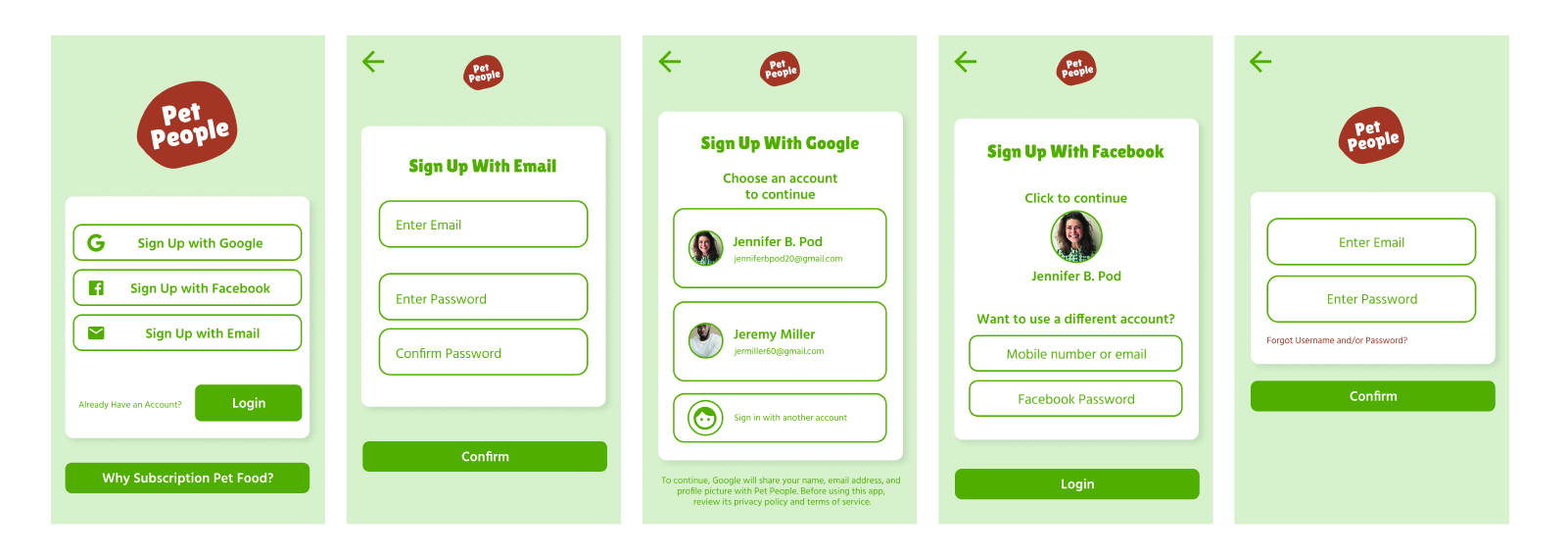
Registration and Login
Registration screens were designed to make users sign up or sign in quickly. Users can also register using their Facebook or Google linked accounts.
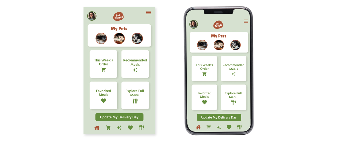
Dashboard
This is one of the most important screens. It is the central hub users will use to navigate between all other screens within the app once they establish an account.
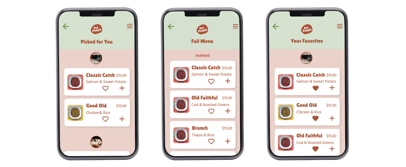
Food Menu Screens
The food menu screens are very important, as they give users the options to view choices of food according to the users preferences. There is a 'Picked for You' menu, which consists of recommendations generated for each pet based on past order history. There is a 'Your Favorites' menu which displays all items the user has selected as favorite for a quick view. There is also a 'Full Menu' option for users who prefer to see all items available for purchase.
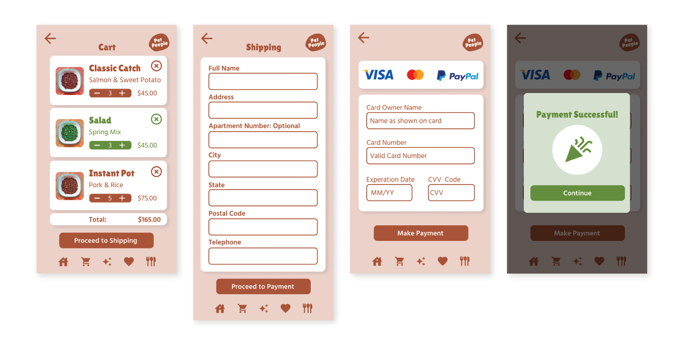
Cart and Payment
The checkout process was designed to be quick and easy for users. Here the users can view their cart and edit items for purchase before proceeding. Shipping and payment was designed to be simple and straightforward.
Clickthrough Prototype
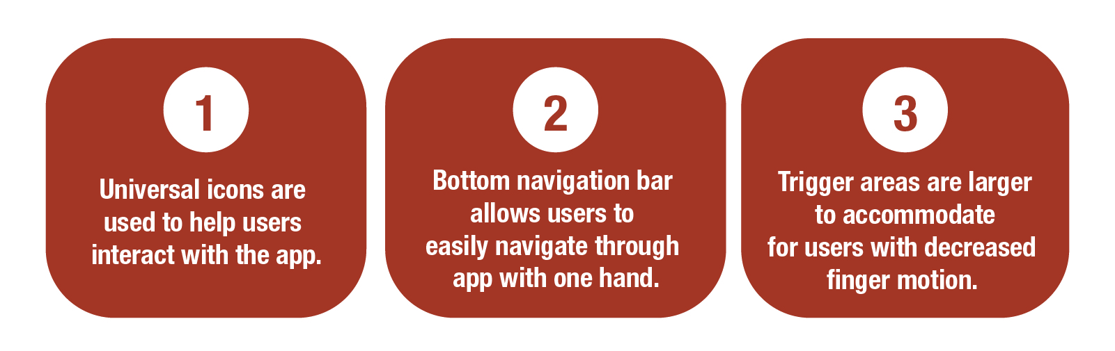
Accessibility Considerations
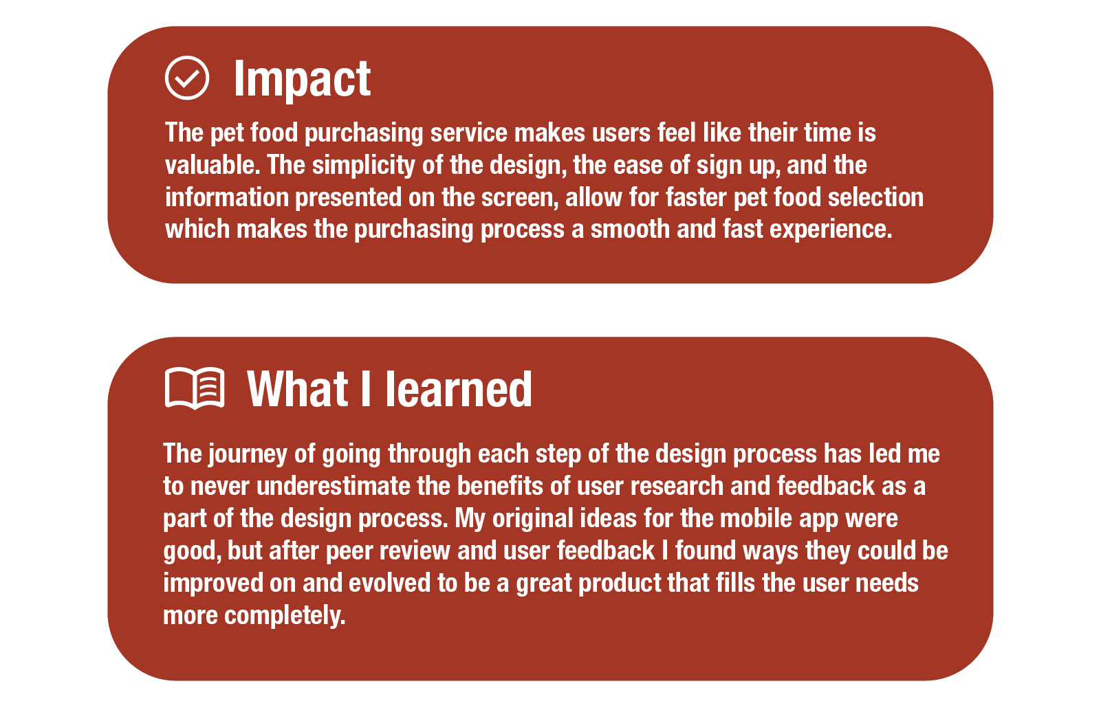
Takeaways
Being a pet owner myself, working on Pet People was highly rewarding. I got to experiment with Figma, where previously I had no experience with this type of software, and brought to life a pet food service I myself would use. I did not get to fully design other features I wanted to within Pet People, and only was able to design a flow for cat food, due to time constraints. However I do plan to incorporate the features into future projects.
Let's Connect: