App Design For an Interactive Color Educational Experience
Project Overview
Background
Buolor is a mobile app targeted to young children who are beginning to learn colors. Through an interactive experience accompanied by audio, it allows young users to see a character change colors through tap gesture and hear the name of the color spoken to them. The app also provides object identification through tap of the characters themselves. Inspired by the fustrations my own toddler was experiencing through looking at photos on Google Images, but not able to change the color of objects he was looking at, Buolor wants to make education for young users friendly and fun. The overall app design is simple to use and straight to the point. Learning colors is a foundational education for young children and should be interactive and fun.
Objectives
Design an app
Create a mascot character
Create secondary characters
Record voice over
Project
Mobile app design with sound effects, concept.
Role
UX / UI Designer, Voice Actor, Character Designer
Project Duration
24 hours, broken up over a week
Team
Self-directed, with feedback from peers
Problem
Young children learn best through experimenting with objects, but often color education is presented through different objects, which can pull attention away from color education and towards object identification.
Solution
Provide young children an interactive experience where the colors of an object change so that they can focus on the color difference, not the object difference.
Research
In addition to multiple observations of my toddler's personal frustrations trying to change colors of static images online, I conducted market research via the Google Play Store to experience educational apps targeted to young children to learn colors. I wanted to get a hands-on experience of the options available.

In analyzing the apps, I realized there were specific details to avoid in my own design.
Pain points
Pay wall
Many apps make limited features available to entice users to download the product, but have the majority of features behind a pay wall. Children’s apps are not innocent to this methodology. However, most parents choose not to spend money to unlock the full features of an app that may only be used for a short time. This leads to frustrations for the young child, as they do not understand what it means to ‘pay’ for something and simply view the objective they are trying to reach as broken. Often this leads to discontinued usage of the app by the child as this leads to loss of interest in the product.
Games are short
Many of the educational options to teach young children colors I experienced were short games. While the games met the objective to teach colors, the product falls short on holding a young child’s interest. Young children have short attention spans and need many options provided to give them change in stimulation. Otherwise they will grow bored and drop off the product. Most of the games provided at most two options for color education, which just does not meet an expected amount for the child to have to cycle through.
Key Research Insights
Details to consider in my design...
Engaging sounds and animation
Young children have a short-term interest in things around them. To ensure the child is engaged and retaining information, clear audio that speaks out the word plainly is best for young children to understand. In addition, fun graphics are going to hold a young child's attention better than a color swatch will.
Bright colors
Since young children are at the beginning stages of development, bright simple colors that have high contrast entice them and hold their attention. When a young child is learning colors, it is best to present them with a bright shade of blue so they can learn to recognize the hue.
Horizontal orientation
Many products targeted to adults have vertical orientation as there is a need to have access to more information with srcolling gesters. However, apps targeted to young children need larger graphics, which is hard to accomplish in vertical orientation. Developing children apps in horizontal orientation not only allows for more screen real estate for design, it also considers the limited functions their small hands have, giving children a better experience navigating through apps.
Larger buttons for small hands
Young children have under developed hands and struggle with smaller tap targets that need point-accurate motor skills. Larger tap areas not only allow young children to have access to digital tools, but also provide an experience with which they can continue to develop fine motor skills without fustrations, while using their hands.
Looping
Young children do not understand the meaning of 'ending'. When a sequence ends, young children may become upset because they feel like the experience they were enjoying was taken from them, which hurts their feelings. An interactive experience that is setup to loop as long as the child wishes to continue engaging with it, with a backout button for them to choose when the experience ends, will be a more valuable learning experience to the child.
Strategy
‘How Might We’ Statements
- How might we help make the educational experience of learning colors fun for young children?
- How can we respect the accessibility needs of young children who do not have fully developed motor skills?
- How can we hold a young child's attention through the interactive experience efficiently using a simplified product?
Design
Sketches
My goal was to create a simple layout for young users who have lower developed mobility in their hands and relatively low understanding of technology. I wanted my young users to have fun with the app while learning colors.
After I collected my notes, I began brainstorming possible layouts for the main screen.
These initial ideas turned from sketches...
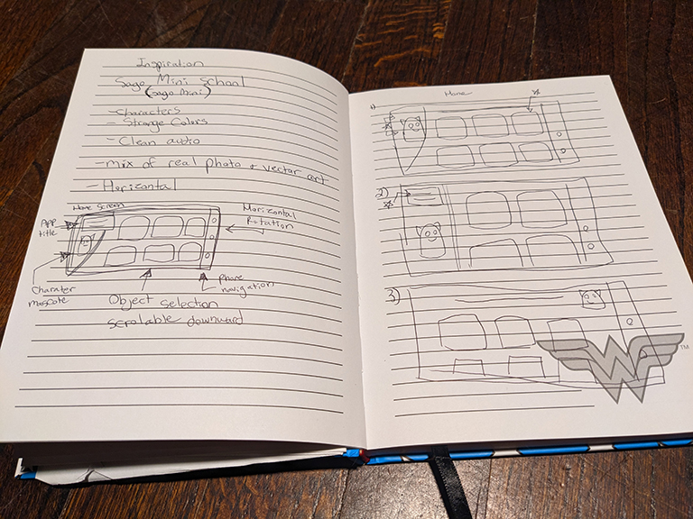
Into wireframes...
Low-Fidelity Usability Test
Participants
- 1 participants, age 2, male, is in the target age range of the app.
- Method: Moderated
Tasks
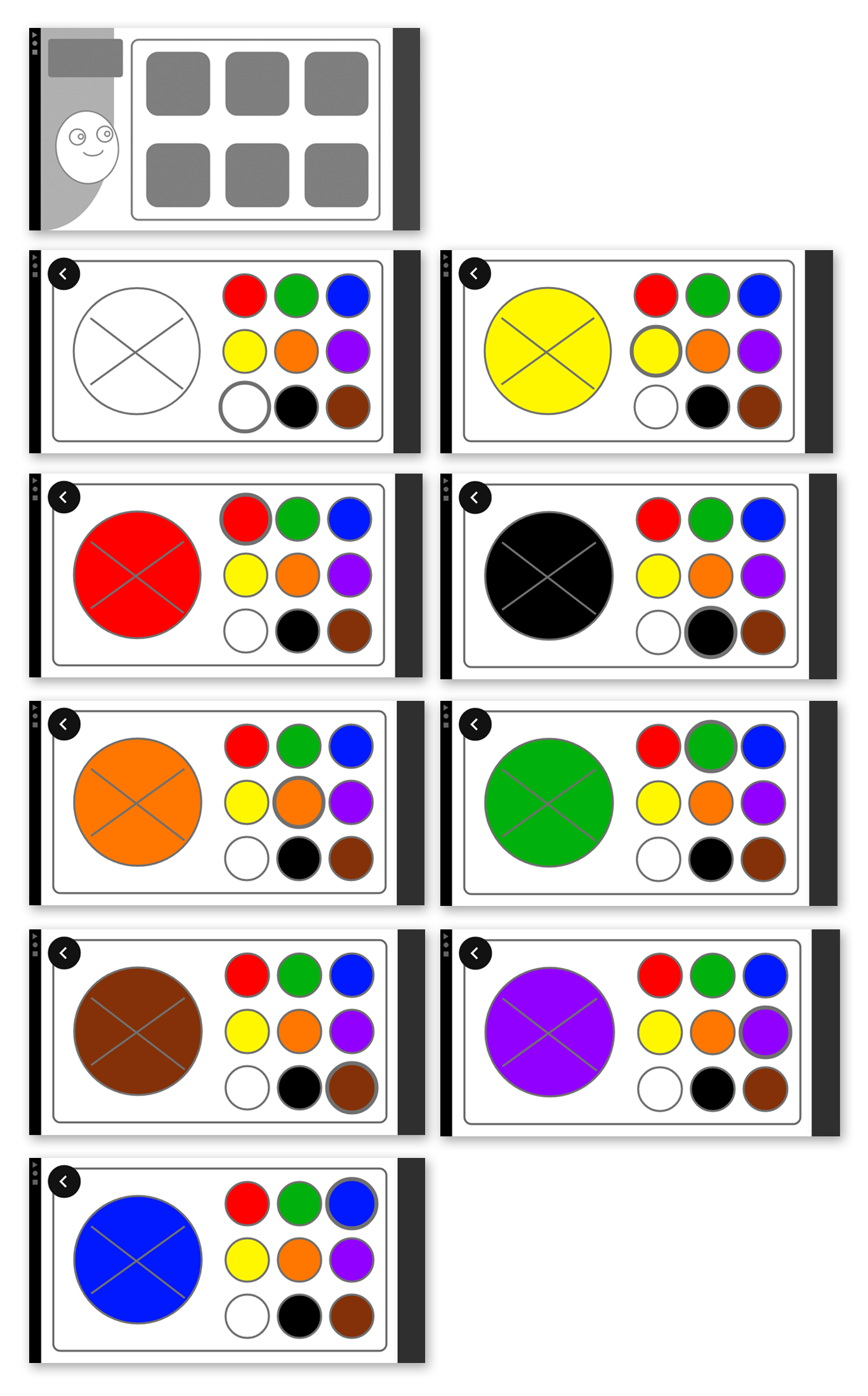
- Navigate through the list of character placeholders on the main screen.
- Select a character placeholder and trigger color change.
Key Outcomes
- The user was able to accomplish all tasks.
- The user was drawn to the placeholder mascot character and was able to trigger the interactivity of the character.
- The user responded well to the audio element triggered when the colors are tapped.
- The user was not defaulting to a vertical scroll setup of the character list and became confused why the list did not scroll horizontally.
The Designs
I wanted to make the overall design colorful, stylized, and not gender-conforming.
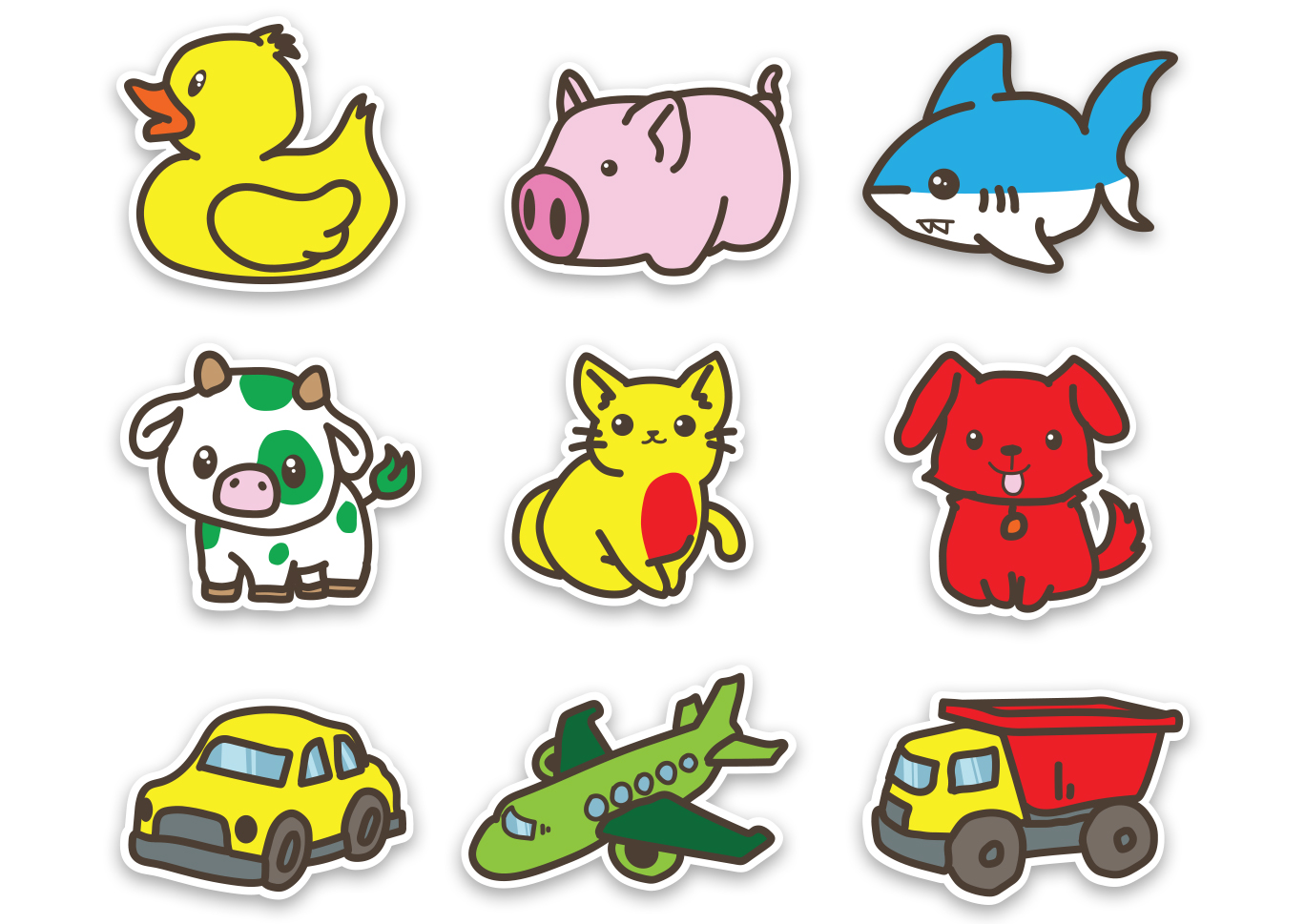
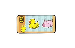
Character Designs
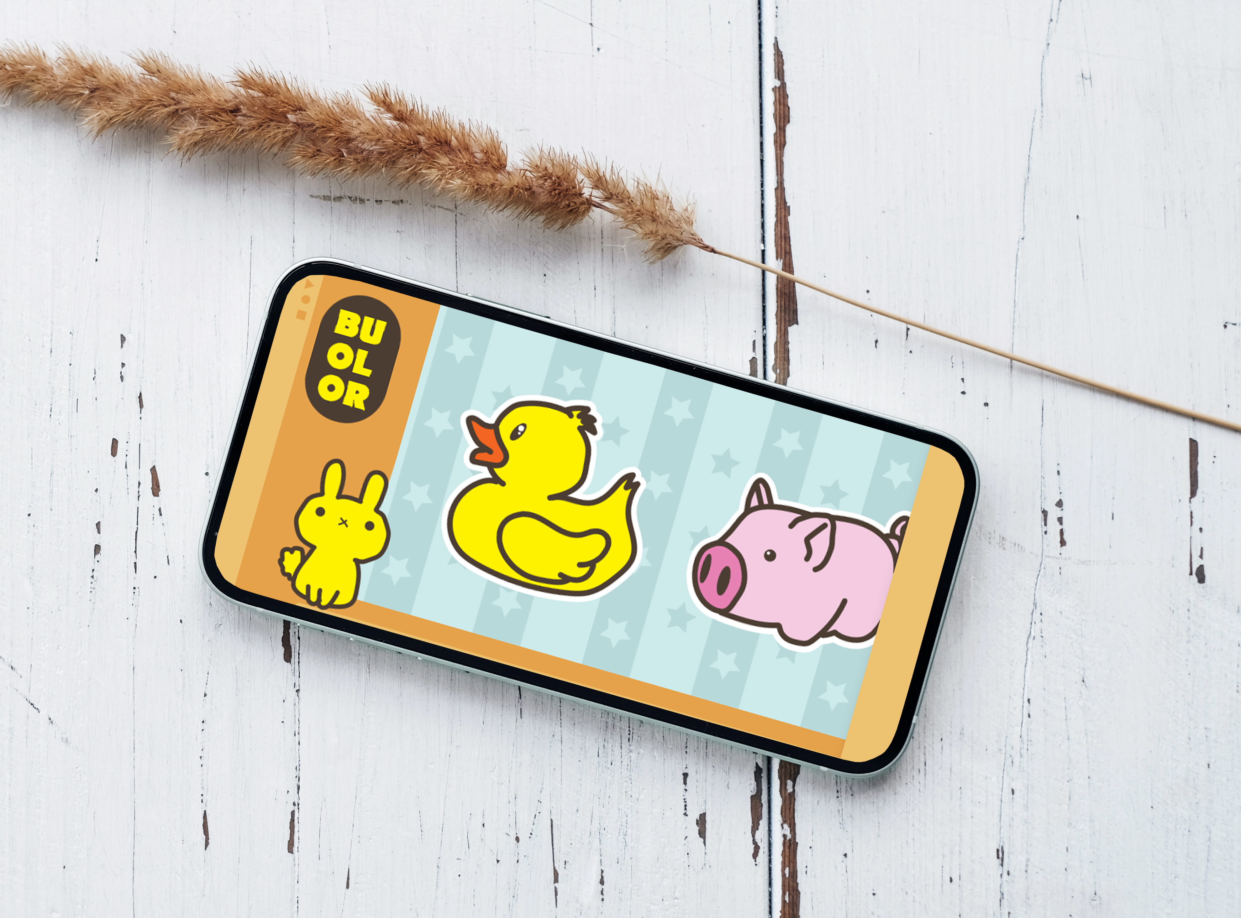
For the character design, I was inspired by a combination of stickers and rubber bath toys. I wanted the characters to be presented in a fun way for young users and I believe this satisfied that stylization target.
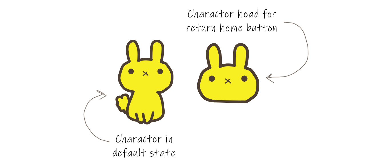
Mascot Character Design
Mascot characters are the face of a product and the hook for young children to return to continue use of the product. I wanted the mascot character to not be a logo slapped on the app, but to be a fun interactive element adding to the experience of the app.
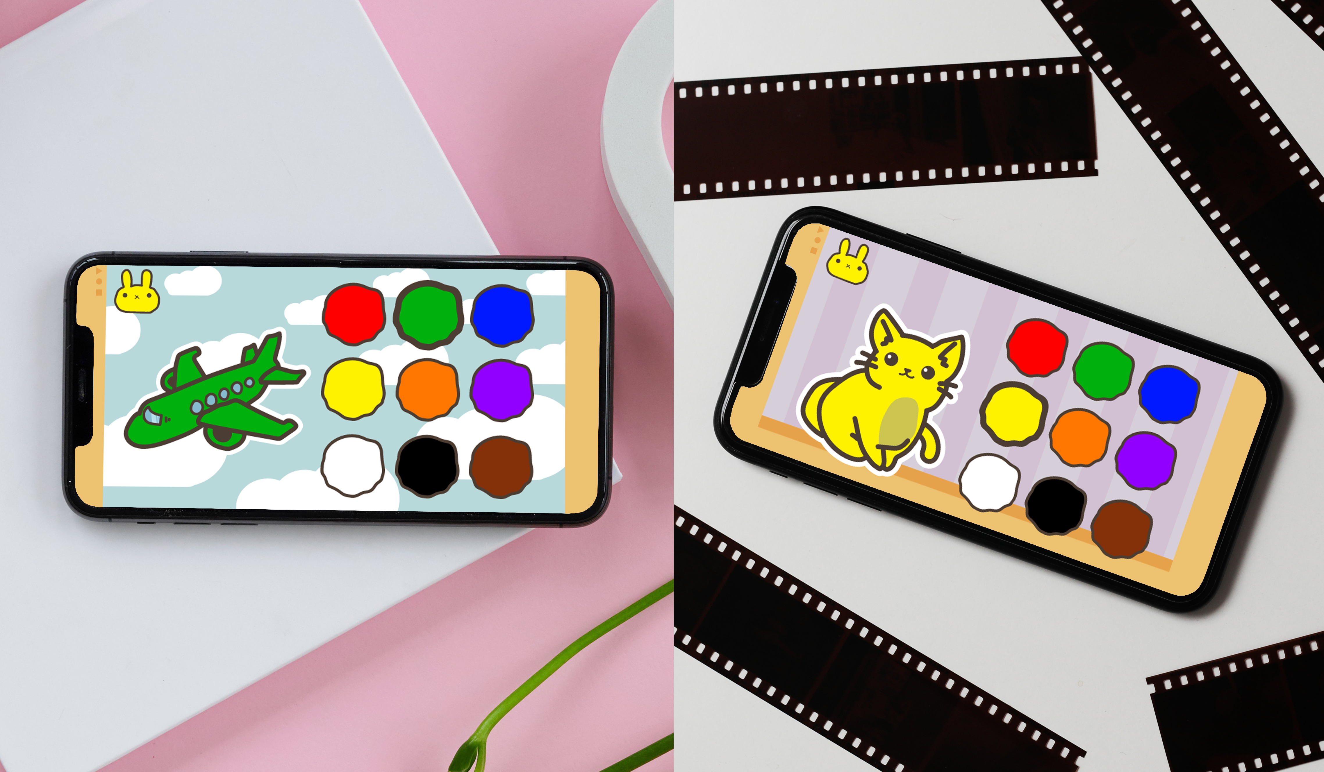
I defaulted to a bright yellow rabbit as the color is bold and the character is simple.
With understanding that young users are often not yet familiar with standard UI icons, which adults would know from years of experence with mobile apps, the mascot character was designed to also function as the back button. Young users may not recognize an arrow or X icon as ‘back,’ but easily will pick up that if you click the rabbit’s head you will navigate back to the page with the rabbit.
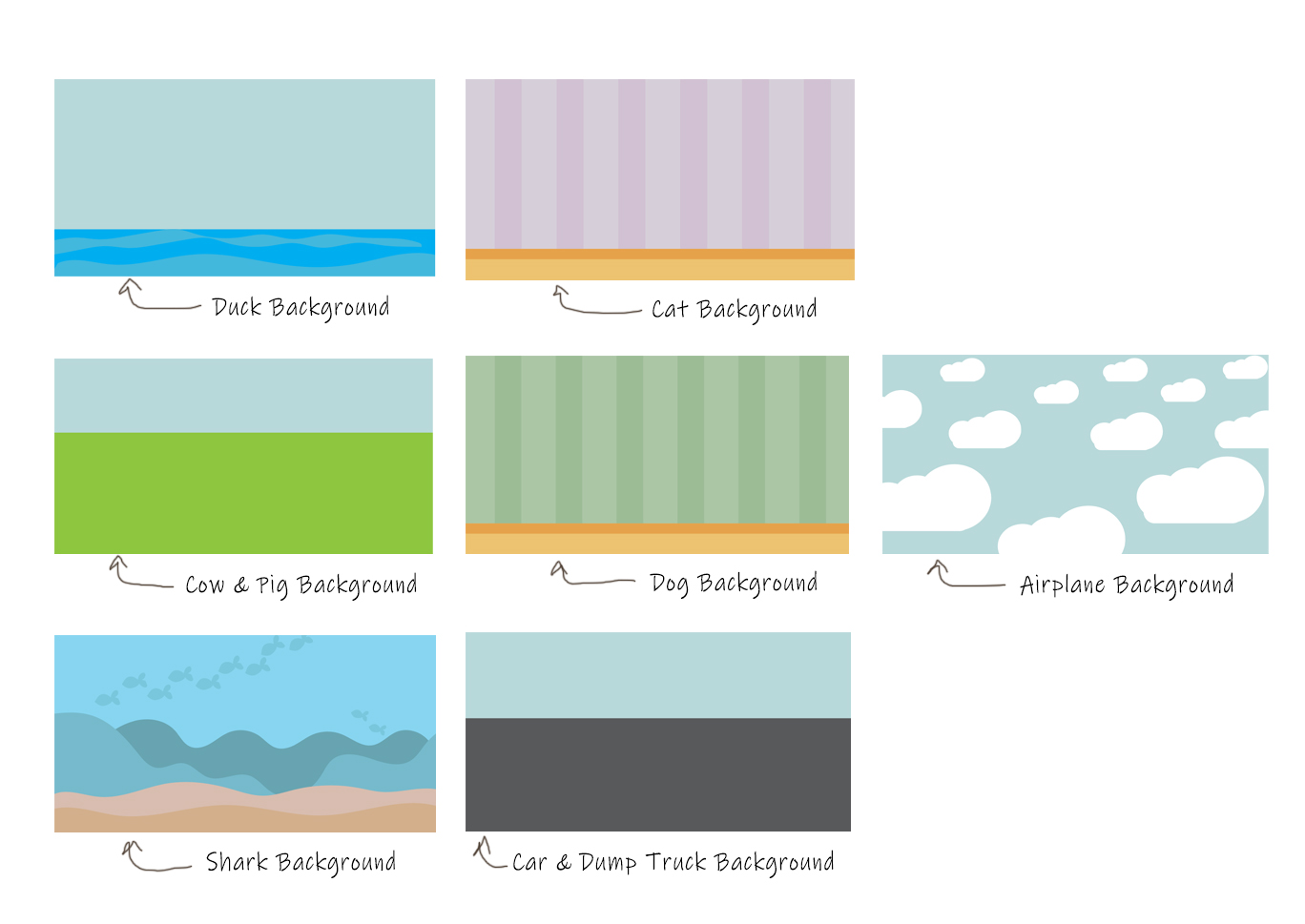
Background Designs
I wanted the backgrounds to be simple and ground the characters with the settings. I wanted the backgrounds to be reusable for similar characters, such as the pig and the cow.
Voice Over
When teaching young children about colors or objects it is important to not only show them the object but to also vocalize the object so that they can build up memory. Because of this it was important for the app to include audio triggered by touch that describes the objects and the colors the young user is interacting with.
Several takes of each sound was recorded so that way the clearest pronouniation of each word could be selected and used in the prototype.
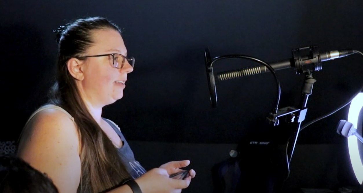
Project Walkthrough
I documented my experience working on this project and published the video on Youtube.
Play the video below.
**Prototype is best viewed on a mobile phone with auto-rotate setting turned off
High-Fidelity Usability Test
Participants
- 1 participants, age 2, male, is in the target age range of the app.
- Method: Moderated
Tasks
- Navigate through the list of characters on the main screen.
- Select a character and trigger color change.
Key Outcomes
- The user was able to accomplish all tasks.
- The user was drawn to the mascot character and was able to trigger the interactivity of the character. However, the user felt the character was sad.
- The user responded well to the audio element triggered when the colors and characters are tapped.
- The user expressed there were not enough character and color options.
- The user tried to trigger animation from the Buolor logo and displayed disappointment that this element was static.
Conclusion and After-thoughts
Buolor promotes color learning through positive experience. The app provides a simple and fun environment to teach young children colors without the negative experience a fixed ending provides to children who do not yet understand the concept. Young children choose to continue in the loop until they want to switch characters, making the experience positive.
Consider your target audience in the design.
Since the app is meant for young children who are not fully developed, there was a requirement to make the app accessible to those with under-developed hands. This involved consideration that larger tap targets are needed for young users to be able to navigate through the app as intended. As well, young children are not literate nor are they familiar with standard icons used in mobile app development that an adult would recognize with ease. On the surface this seems limiting, however it opens room to be more creative in the visuals to empower young children to easily understand the functions and have fun with the experience.

As a parent to a young child, this app design formed out of the personal struggles I witnessed my child having with his attempts to learn and understand the world around him while failing to navigate complex technology beyond his current understanding. After evaluating the current services offered in market, I believe that this app could offer aid to families with young children, providing a simple and fun experience to learn colors through object color transformation.
In the future I would expand on the features and design of this app by:
Refine the interactivity of the app.
I believe the product's design would be stronger if all of the characters had an extra level of interactivity beyond the audio playing when tapped. I think subtle animations would add value to the characters and make the experience overall more engaging to young users.
Add more characters to interact with.
I would not consider this app ready to launch until the character library is expanded. For the first round design I kept the character count small, however I believe a fleshed out product would have many more objects covering many categories of things a young child comes across in their day-to-day life. I believe variety would not only work in favor of holding the child's attention, but also add to the educational value of the app.
Refine the animation
The mascot character's movement is currently accomplished through components with auto animate. I think it serviced well for the first test of the product design. However, I believe improvements can be made to make the character more purposeful to the overall experience. I would refine the character further to have several animation states that play at random as the young user taps.
Further, I believe animations should be incorporated throughout the rest of the app's design. When the screen changes the elements could have a slight whipping animation added to give the appearance that the screen is pulling into frame. I think all characters should have animation incorporated to play when tapped, accompanying the audio tracks that play.
Thank you for reading Buolor case study!