Mobile First Design for a Secondhand Baby and Toddler Products Brand
Project Overview
Background
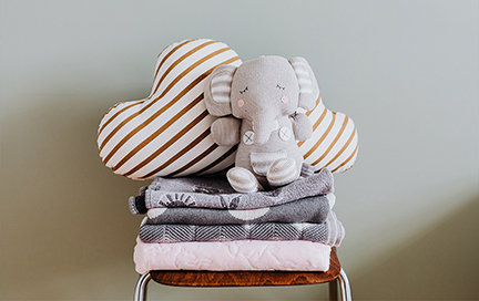
Little Bundle Box is a responsive website with a companion app for parents who are raising their children on a budget. It allows users to shop for gently used items, return items when no longer needed, and to donate items. Inspired by moms groups on social media, Little Bundle Box wants to make the purchasing and distributing of baby items easier and safer for families through a user-centered approach to the design. The overall website and mobile app designs are simple to use and straight to the point. Taking care of your children should not be a burden on finances or time.
Objectives
Design an app
Create a responsive website design
Create a logo
Project
Responsive website design with companion app, concept.
Role
UX / UI Designer, Logo Designer
Project Duration
6 months
Team
Self-directed, with feedback from peers
Problem
Most parents with young children are looking to save costs on certain high turn around child products by shopping for secondhand items, but struggle with uncertain quality, uncertain cleanliness, and time demands when shopping secondhand.
Solution
Help users shop secondhand for necessities faster and safer
Research
Secondary Research
- Recent research suggests that between birth and the age of 18 a family will spend about $310,605 — or about $17,000 a year. The exact amount varies on location and earnings.
- According to the Council for Textile Recycling, 80 to 90 percent of items donated to charities are sold to recyclers.
- The value of the global toy market exceeded $90 billion (USD) in 2019, but with some claiming as much as 80% of all toys end up in landfills, incinerators, or the ocean much of this value is lost when toys are thrown away.
- Rising awareness about the high costs of raising a child.
- Despite the high interests in secondhand items to reduce costs, a large amount of products ends up in landfills, exacerbating pollution.
- The biggest user pain in secondhand purchasing apps is unreliable quality guarantee. You need to scroll through a lot of listings and eyeball what is believed to be good quality, but there is still concern about the condition of the item and the home it is coming from. It's overwhelming and scary for users.
- Although purchasing products new can be a financial burden on low budget families, the filtering system is more robust, making it more ideal for busy families as it saves time.
- How might we help make the purchasing process faster when shopping for secondhand baby products?
- How can we respect the varying range of time that children use the products?
- How can we help the personas utilize their home space efficiently with how many items a child goes through in the first years?
- 7 participants, age range 29-40, 4 female and 3 males, are parents or have young nieces and nephews.
- Method: Unmoderated
- Go through onboarding, sign up for an account, and reach the dashboard.
- Select a bundle box and complete the checkout cycle.
- Complete a return.
- 57% of the users were able to accomplish all tasks.
- Users appreciate the simplicity of the app makes it quick for parents to use.
- Users like the idea of a bundled box product service that would collect needed products in one place.
- Users want something within the app that gives assurance that products are clean and not damaged.
- Some users were not familiar with names used to label certain sections of the app.
- Some users were not confident they understood the purpose of the app.
- 9 participants; test preformed on 7 Apple mobile devices, 1 Android mobile device, 1 Microsoft computer.
- Method: Unmoderated
- Go through onboarding, sign up for an account, and reach the dashboard.
- Build a custom bundle box and complete the checkout cycle.
- Complete a scheduled return.
- 60% of the users were able to accomplish all tasks.
- 67% of the users found the app easy to use.
- Most users were able to complete the first task; tasks two and three had a drop off rate of two users each.
- Adding more product categories.
- Expanding on product shopping function to offer robust filtering of products so users can focus their shopping when searching for color-specific, gender-specific, or age-specific products.
- Expanding on payment options by offering payment plans.
Although I recieved a lot of insights from reading articles and researching online, I wanted to extend my compassion to real parents and hear their personal experiences purchasing child products and their thoughts on secondhand items. I connected with parents in my area through social media via local parent groups. I sent out an anonymous survey via a short questionnaire with several questions focused on the feedback of their experiences purchasing child products. The survey received 17 responses.
See the survey questions here.In analyzing the responses, I realized the community shared some major pain points.
Pain points
Price does not align well to use time
Many products such as clothing and toys have high price tags when purchased new, but are not used for long. Some clothing items are only used for a few months before the child grows out of them. Other items such as toys are often used very short term before they either break or the child loses interest. Sometimes the child may not use the toy at all before it is discarded.
Secondhand quality is not reliable
Since secondhand items are mainly sold privately over social media or at garage sales, there are no guarantees on quality and cleanliness of items. Items that have fabric components also bring a worry of bugs being brought into the house.
Donating items comes with challenges
When donating items, many parents face the challenge of not having the time to donate or not having anyone to donate the items to. There are not many companies that take used items and properly recycle them. Often, items the child has grown out of are collected in storage or thrown out.
Competitive Analysis
There are several options in the market for parents to purchase child products from. Most are robust shopping experiences meant to make shopping for child products simple and fast for parents. One of the biggest problems found in options designed for purchase of secondhand products is the high volume of products a parent needs to scroll through before finding a product that fits their needs. A parent can end up spending hours scrolling through used product listings before they come across one that the photos are ideal enough to purchase the product. This is where a lot of users drop out and opt in to purchasing at a store that sells new products and has easier, more detailed filtering options and takes less time to navigate. I want to solve this problem by having product listings simplified to specific category needs, helping the parent stay focused on what they need to purchase and to avoid users being caught in analyizing product photography.

Key Research Insights
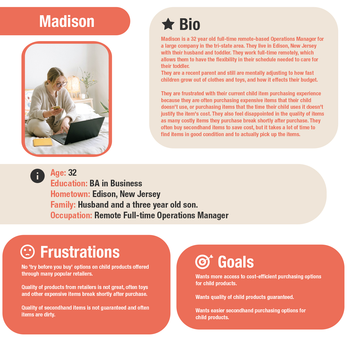
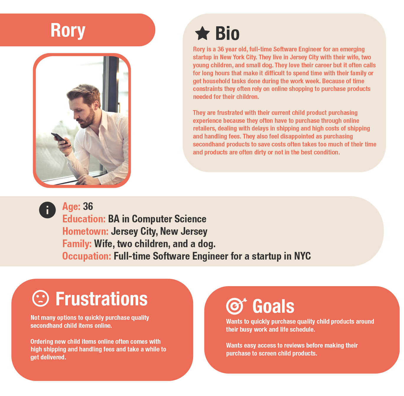
User Personas
Based on these findings, I created two personas who represent the target users I empathized with in the research phase
Strategy
‘How Might We’ Statements
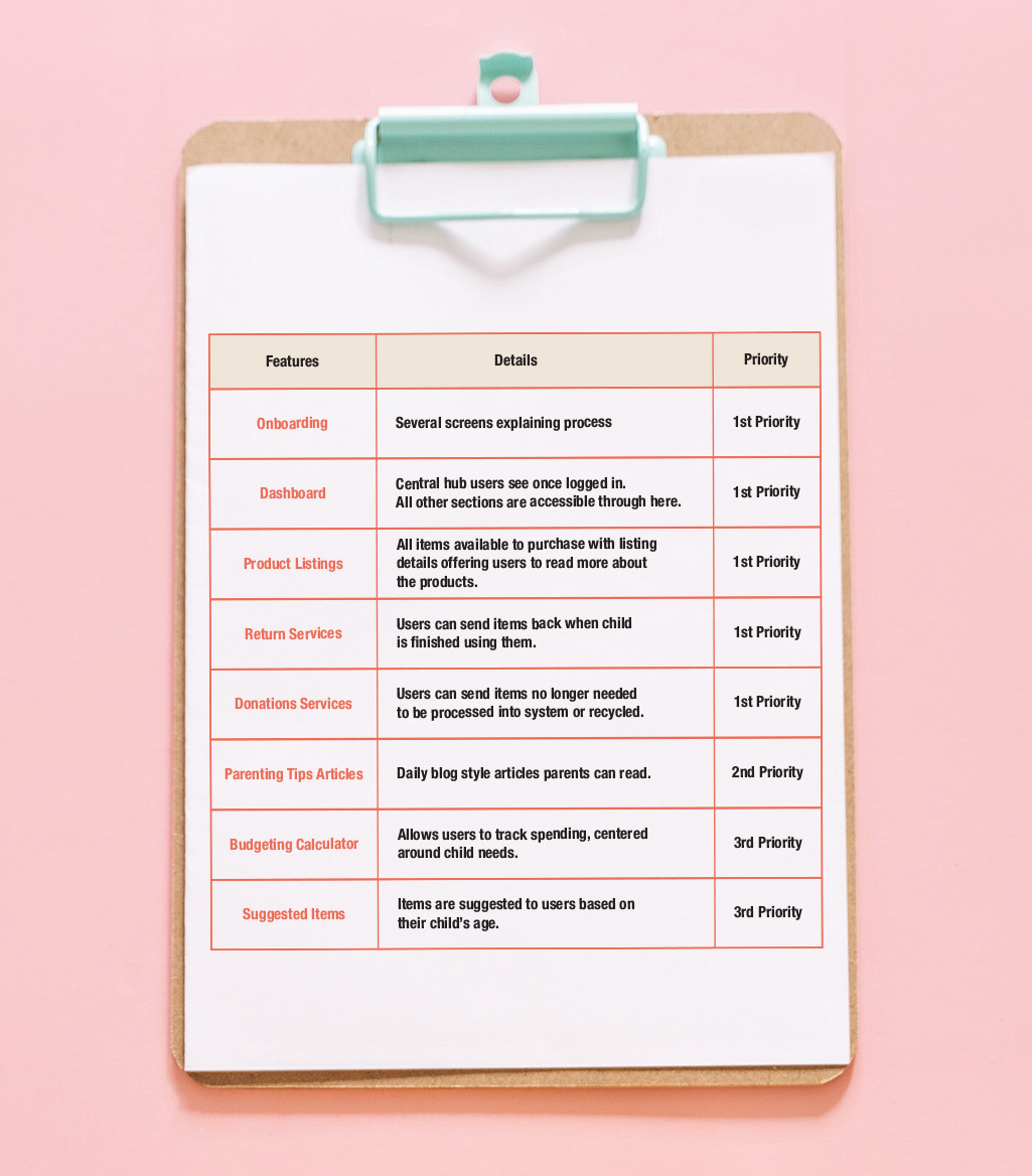
Product Roadmap
I wanted to empathize with my personas (Madison and Rory) and ensure the service would cover their needs of purchasing secondhand items and recycling the items when no longer needed. These needs are not being properly fullfilled currently in market. This service could be an opportunity to fulfill the needs of children, as every child has different needs and children use the same items at different paces.
In addition, competitive analysis has shown that services do not offer users return options outside of set purchase windows, and there are not many donation options that go towards recycling and reselling items that are gently used. That's why having dedicated return and donation options built into a service is an important and unique feature of this product.
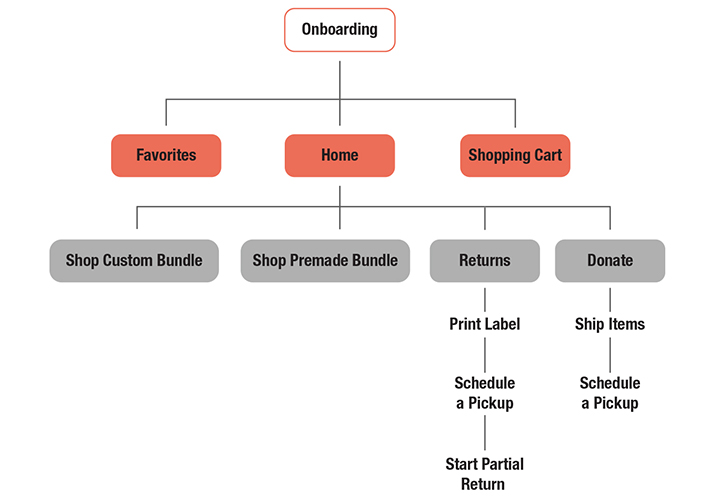
Site Map
The orange bubbles represent the bottom tab navigation options that users will have access to almost all the time. Home screen would function as a dashboard that leads to all other functions of the product, and the ultimate return point for users so they know they have finished a flow.
The Returns and the Donations sections both have multiple options to accomodate different types of user needs around their schedules.
Design
Sketches
My goal was to create a simple layout for users who would be juggling shopping for their child around the daily needs of their child. I wanted my users to feel like their needs are met and their limited time is respected.
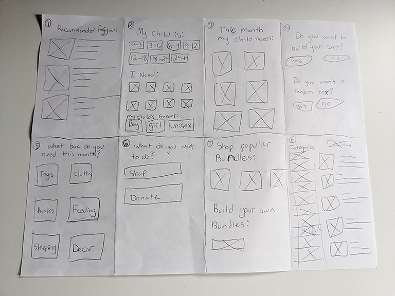
Focusing on mobile first, I began brainstorming possible layouts through the crazy 8s exercise.
These initial ideas turned from sketches...
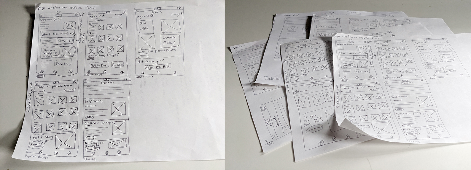
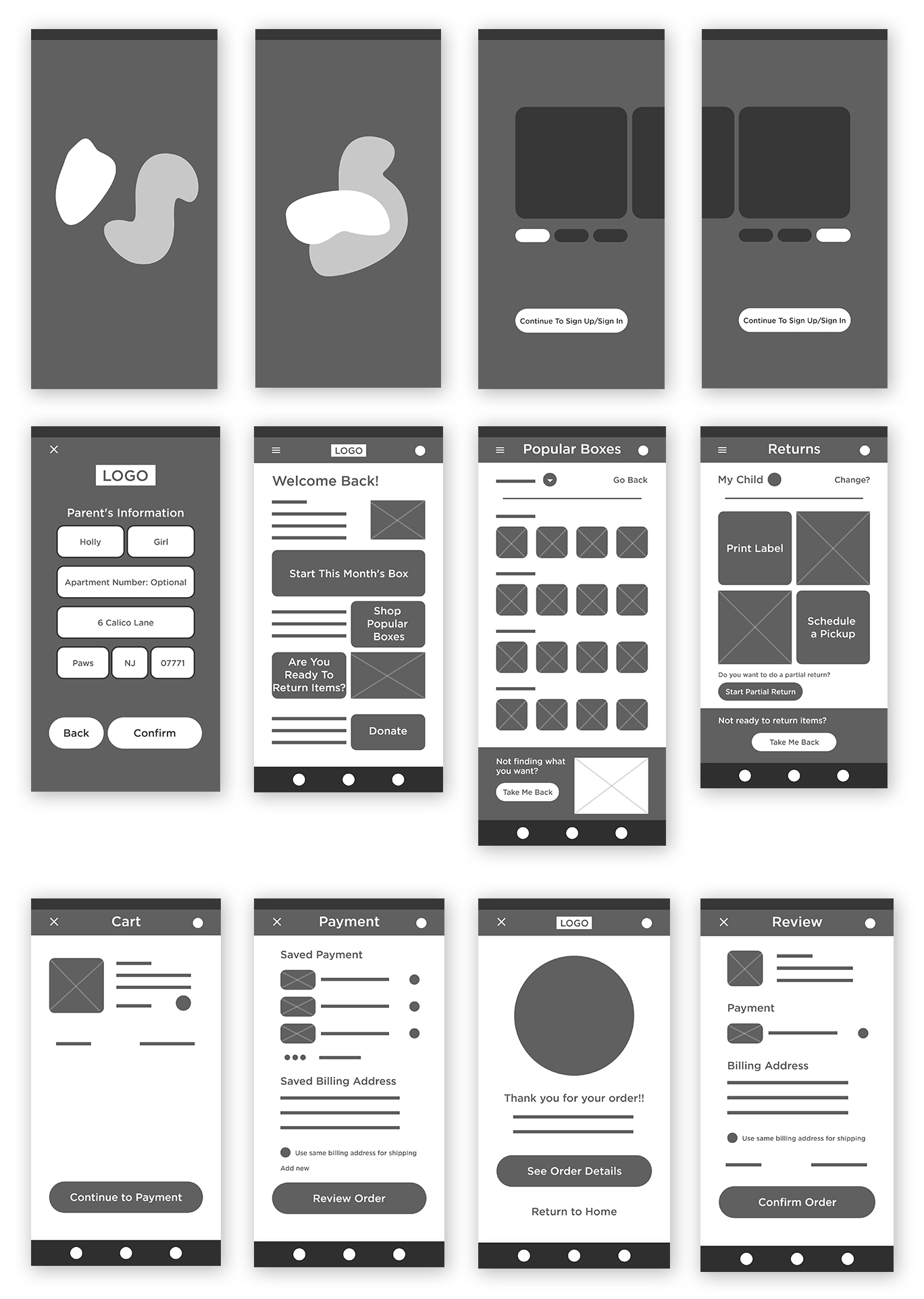
Into wireframes...
Mobile First Low-Fidelity Usability Test
Participants
Tasks
Key Outcomes
“I think the app overall is very easy to use. I like that what you want to do next is right there, there's no question.”
“A lot can go wrong when using other people's stuff, when you're taking stuff and returning stuff and someone else is going to take it and return it. That would be my only concern: How can I be sure the products don't have bedbugs or roaches if they're coming from someone else's house?”
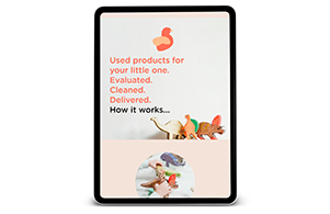
The Designs
I wanted to make the overall design simple and not gender conforming.

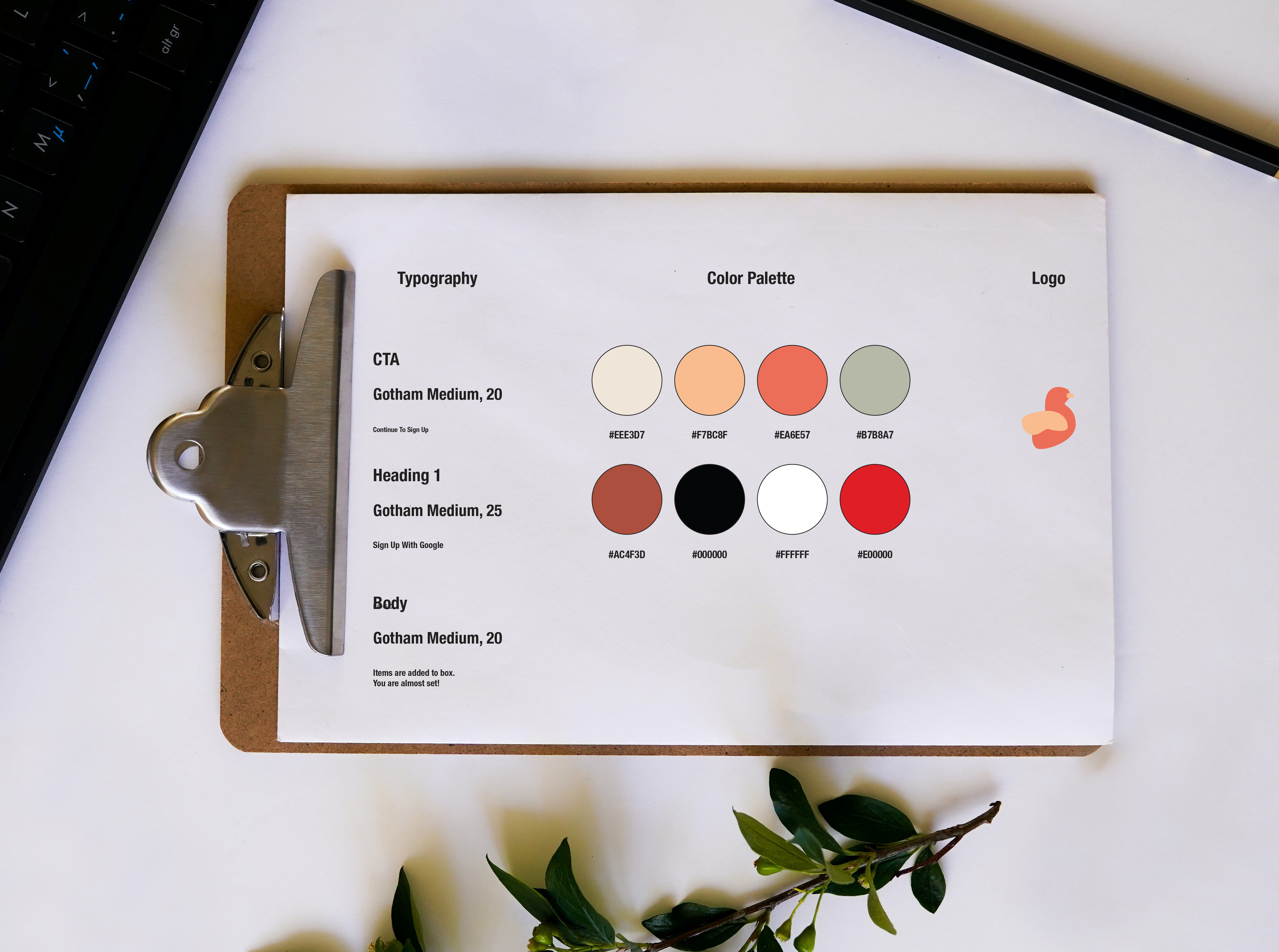
Style Guide
For this design I aimed to use warm calm colors, that would also present a gender neutral appearance.
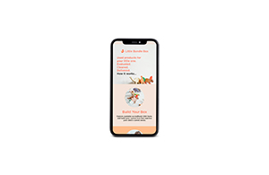
Initial Mobile First Design
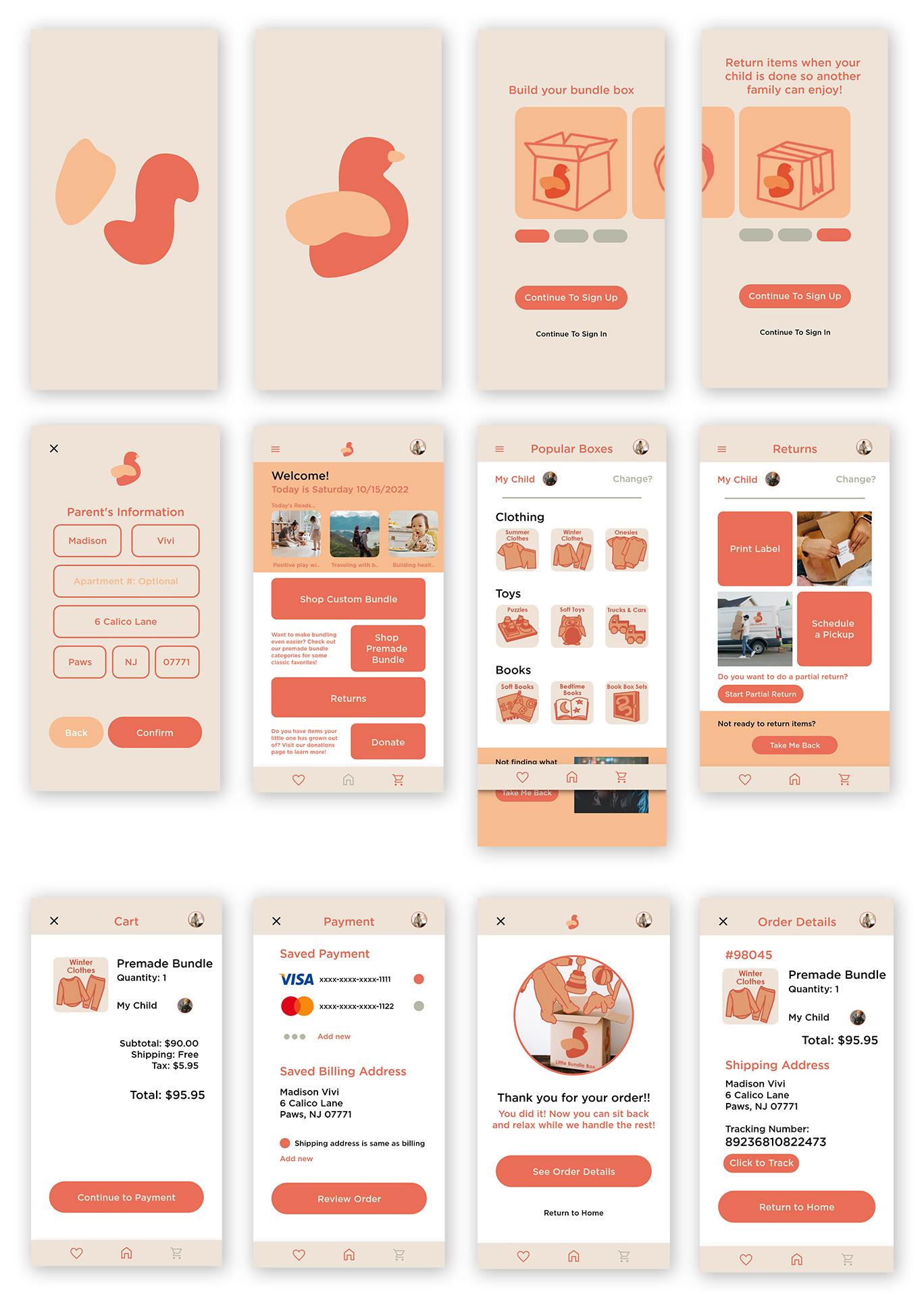
Reflection on Design and Design Overhaul
Once I completed the first version of the design I was not satisfied with the visuals. I felt overall, while the concept was present, the design did not fully service users nor make the functions of the app easy for intended users to use.
I presented the designs to several peers and received feedback on the visuals. Ultimately, I redesigned the app to better meet the functionality needs of the user.
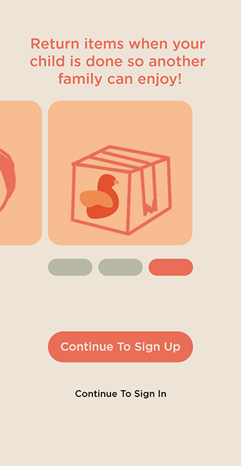
Onboarding
The onboarding experience was redesigned to expanded on details of the main functions of the service. A screen was added that answers questions around sanitation that came up during user testing.
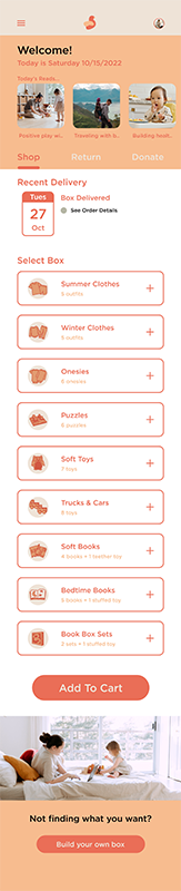
Home Screen
The home screen was redesigned to provide easier navigation through the app for users. Access to the app's main pages were added to the top half of the screen to function as tabs instead of having users scroll downward to find buttons. The home screen was redesigned also to begin the shopping flow, decreasing the click amount within the app, which is more valuable to users with limited time.
Other revised screens
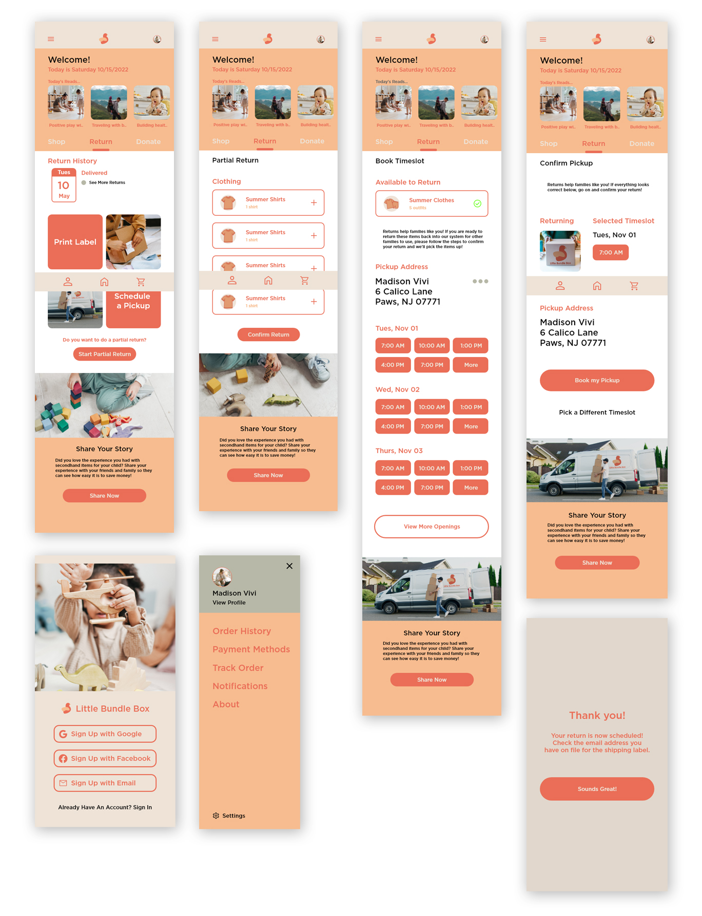
Clickthrough Prototype
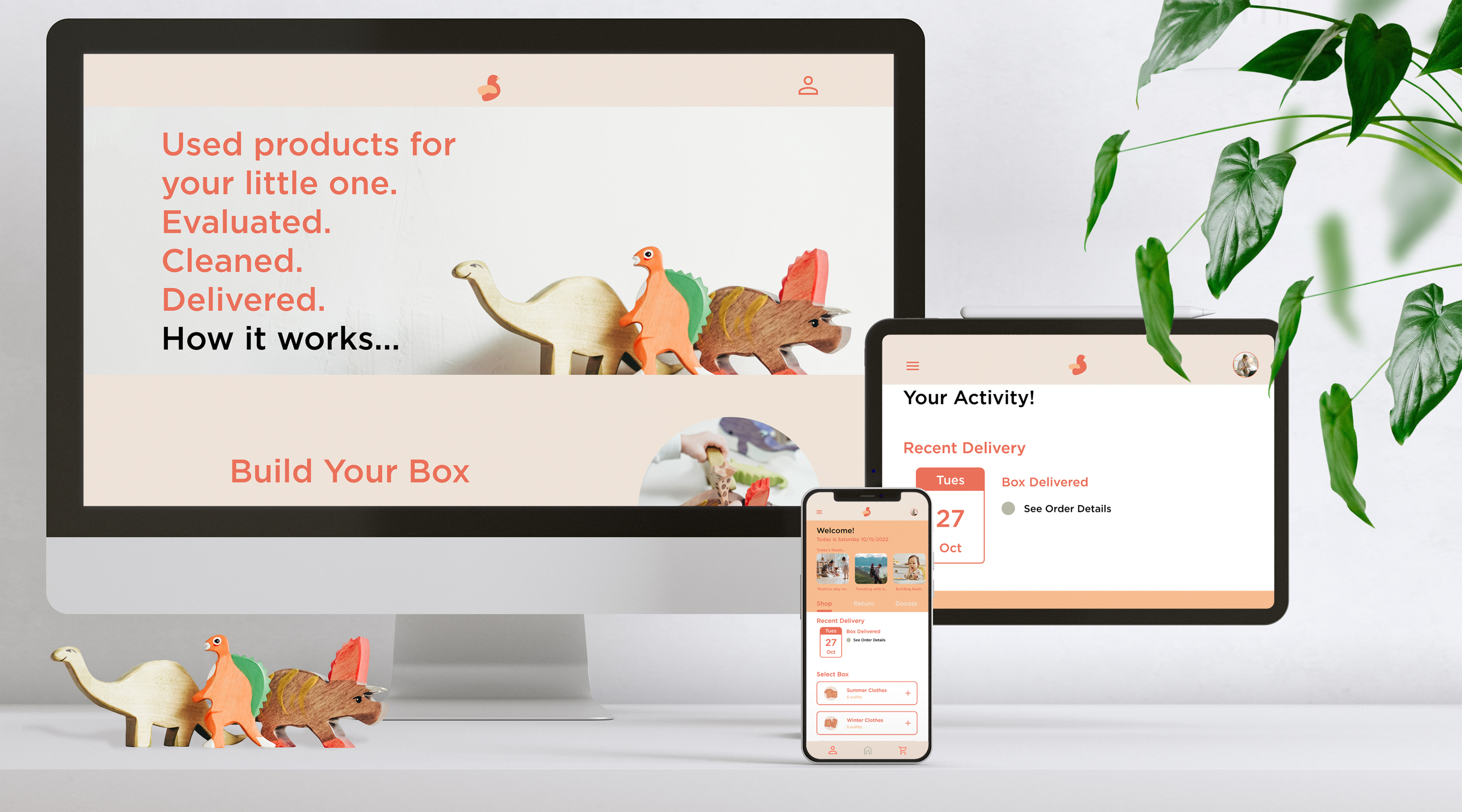
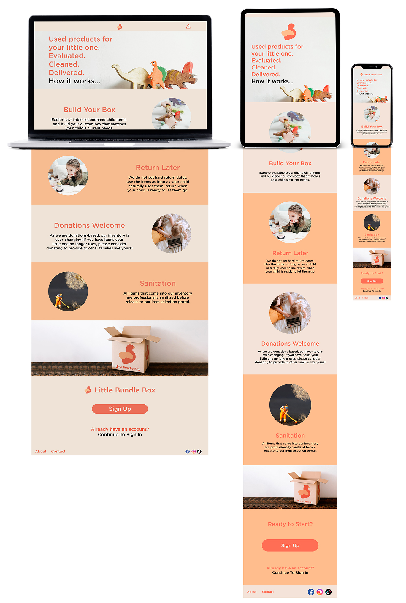
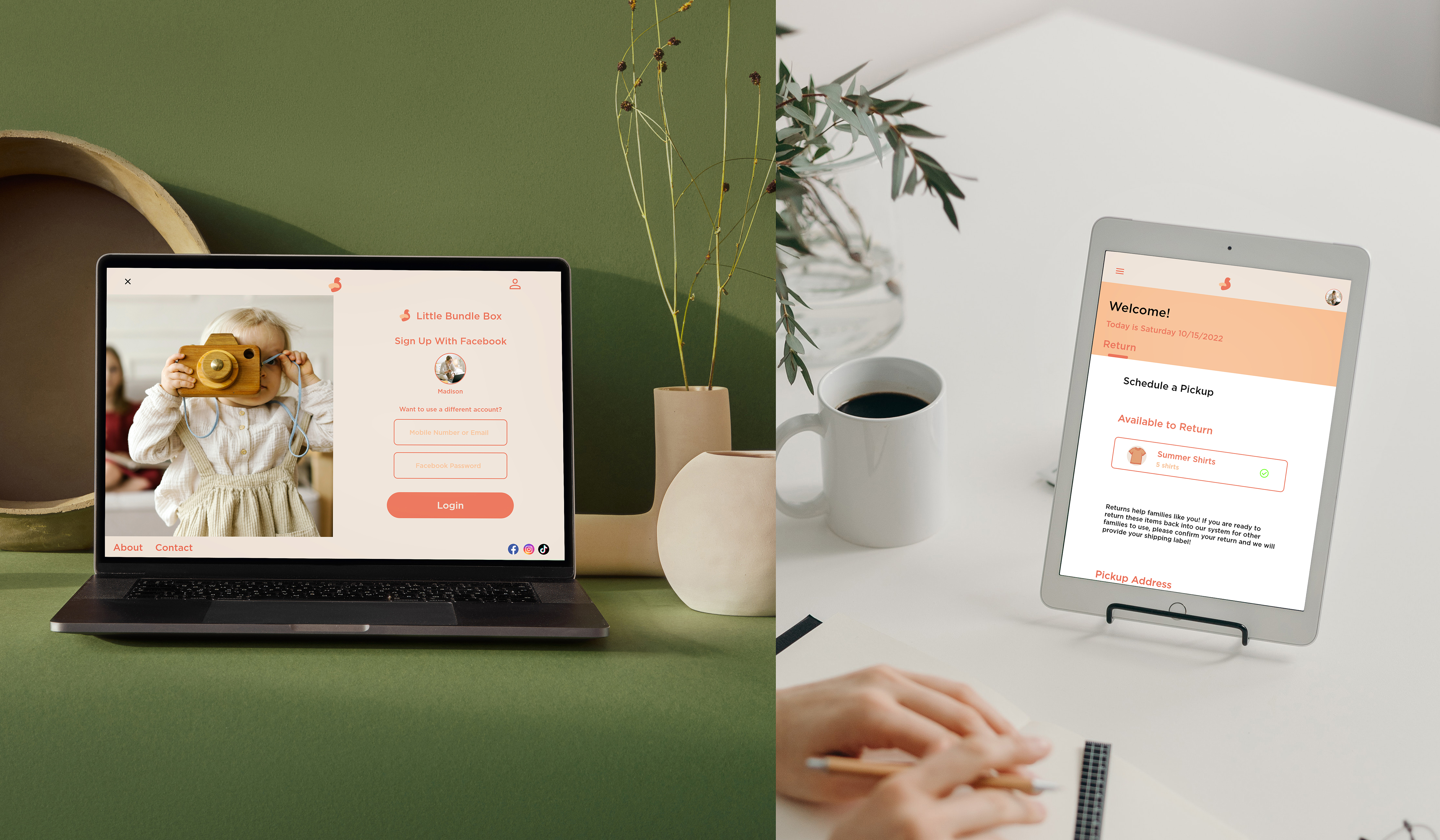
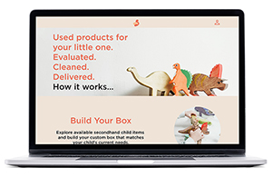
Design Adaptation for Other Devices
The mobile app design was scaled up to other device sizes to allow users easy access to the service from their device of preference. Parents are often strapped for time in the day and may need to access the service from a desktop computer at the office, from a tablet-sized device while watching their children, or from a mobile site where the app is not installed natively on the device. With these considerations in mind, the design of the app changed to meet the functions of a variety of device sizes popularly used by consumers.
Mobile First High-Fidelity Usability Test
Participants
Tasks
Key Outcomes
After-thoughts
I preformed the usability test through the Useberry service to collect screen interaction data so that way I can pin point where in the prototype users have the most difficulty. However, the session records are not available due to a glitch with the feature still in beta phase. While the numerical data I collected is very useful, the missing visual data is a hindrance.
Conclusion and After-thoughts
Do not be afraid to scrap the design
The Little Bundle Box visuals and user experience was poor in my first draft. Throwing out the original visuals and completing a full redesign of the project has lead to an improved product that is easier for users to use while also being visually satisfying.
Keep the device in mind
A failure in my first draft was that I only scaled up the design elements to different screen sizes. Part of my revision included reworking the design, while considering each device it would be experienced on. This lead to a stronger experience for users no matter the device they were using.
As a parent who shops secondhand due to a budget, this service idea formed out of the personal struggles I have experienced. After seeing many other families have the same struggles, I believe this service could offer much needed aid to families with a budget.
In the future I would expand on the features this service offers by:
Thank you for reading Little Bundle Box case study!